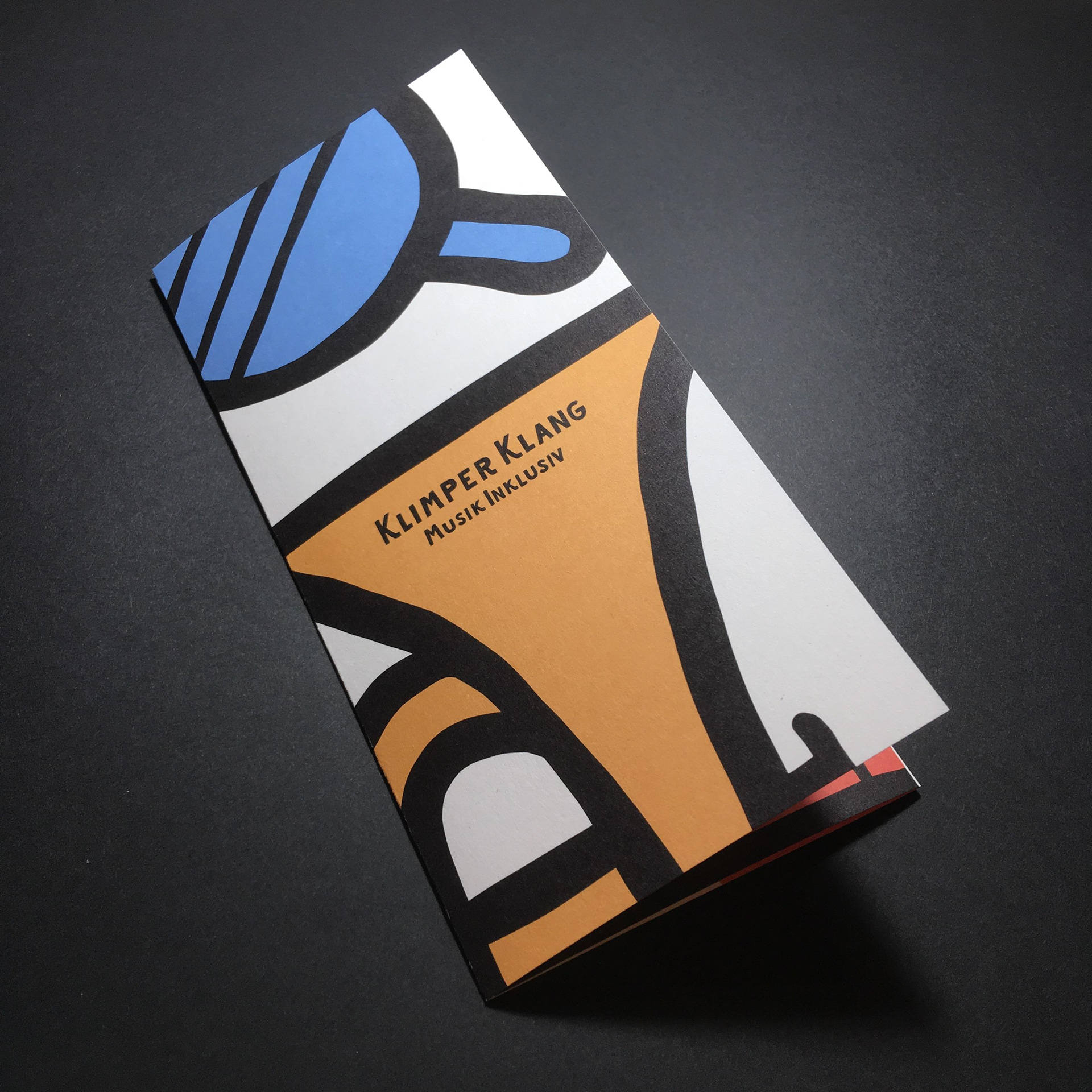
This logo I've designed for Klimper Klang, a music school with a focus on inclusion. The brand appearance should appeal to people who cannot make music perfectly. To take away the fear of that, I drew the logo by hand to give it a slightly playful feel. A too perfect, clean logo could have unsettled some people.
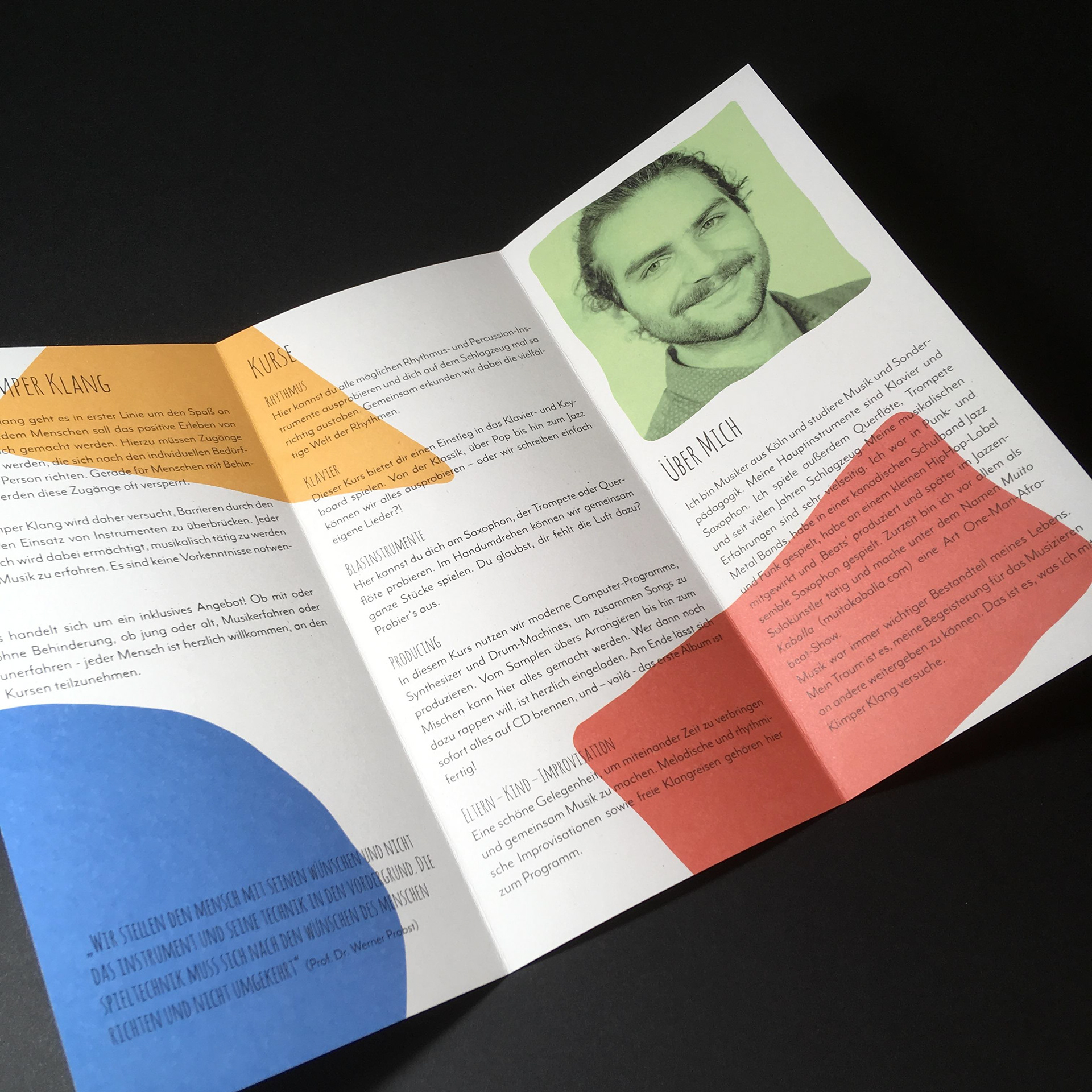
A visual distinguishing feature in the inclusion are the many colours. That's why we decided to use a colourful scheme. These playful colors also help to avoid the fear of making music.
A visual distinguishing feature in the inclusion are the many colours. That's why we decided to use a colourful scheme. These playful colors also help to avoid the fear of making music.